One Epic Place
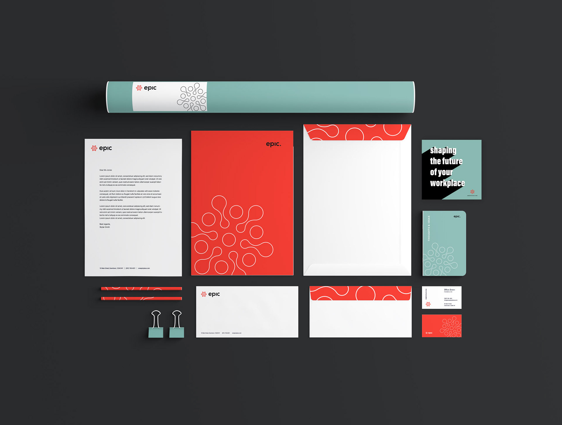
EPIC brand identity was designed to embody its brand attributes: contemporary, colorful, informative and impactful.
EPIC is a hub where a couple dozen local solopreneurs are growing their businesses and thriving, a place that Empowers People and Inspires Change (EPIC).
EPIC’s mission foster a community where local entrepreneurs can work, play and thrive. Encouraging a collaborative environment where their members can share talents, support, and inspire each other and still maintain the autonomy of their own business.
Introducing color
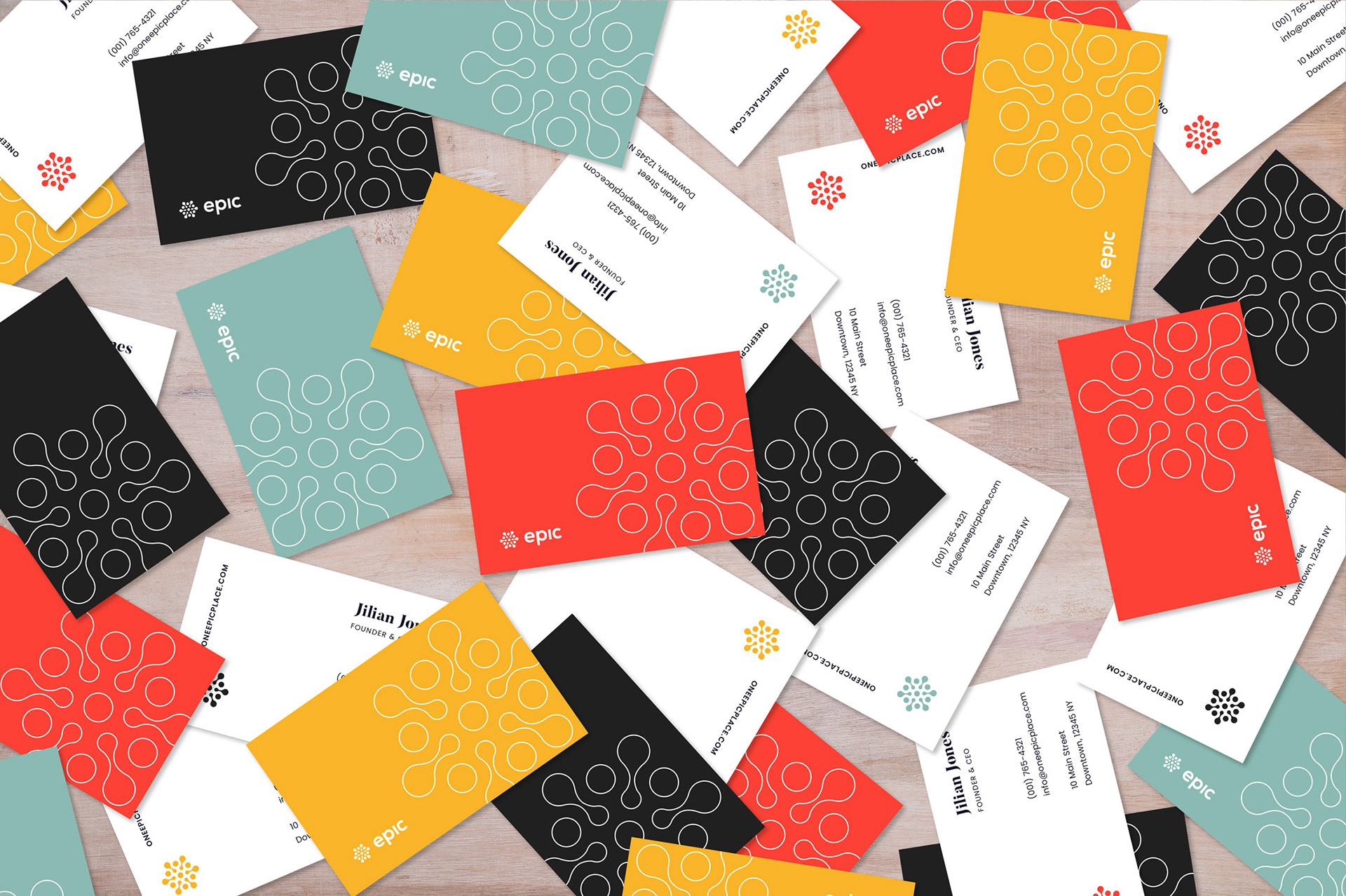
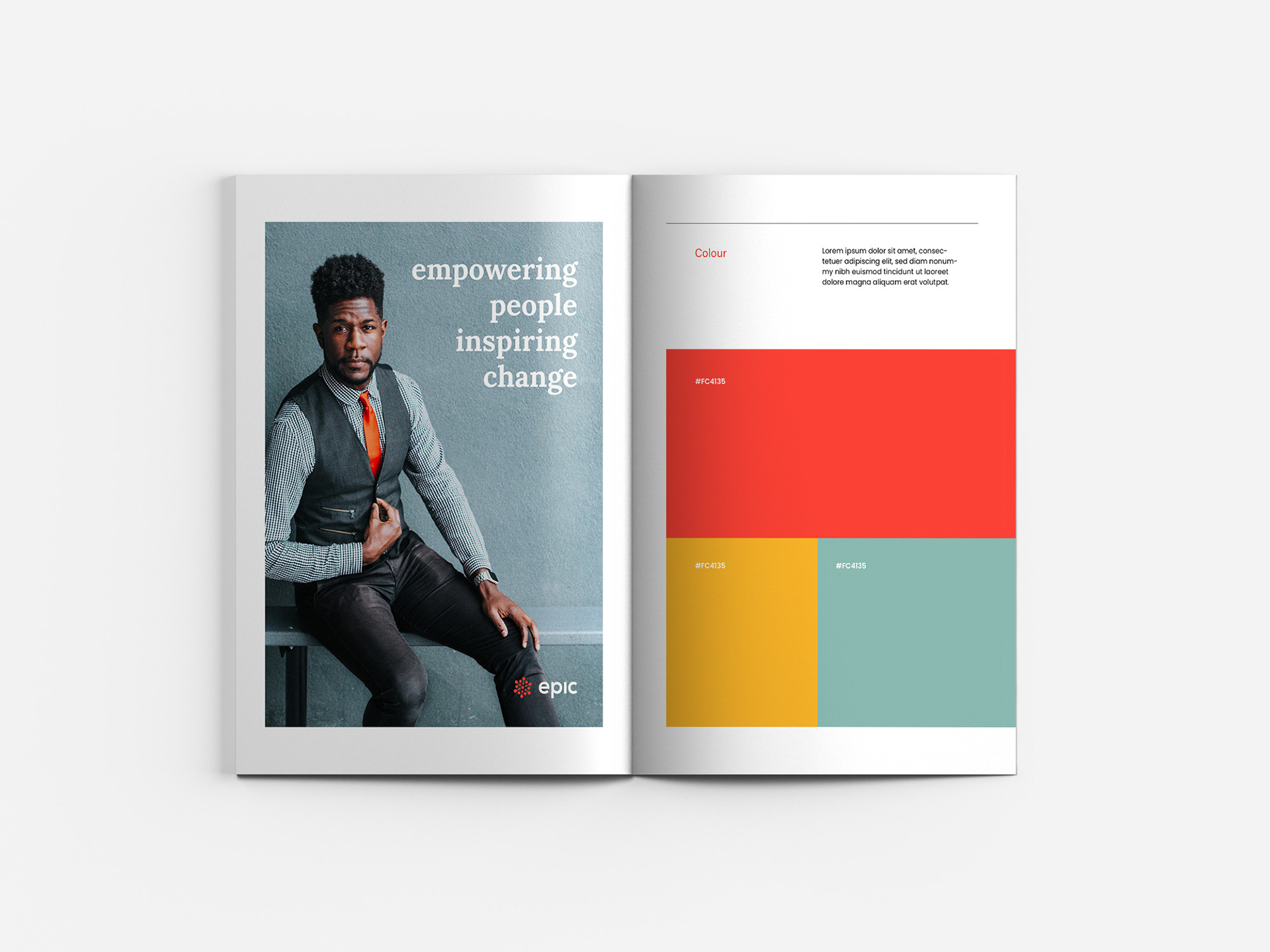
The beauty of color is that it’s going to continue to evolve. The EPIC brand continues to grow. We introduced a color palette to distinguish design elements for our locations, events, annual reports and other collaterals. The goal is to make it feel right. We created a brand identity style guide. Setting design rules and references will help the organization stay consistent within the EPIC brand.
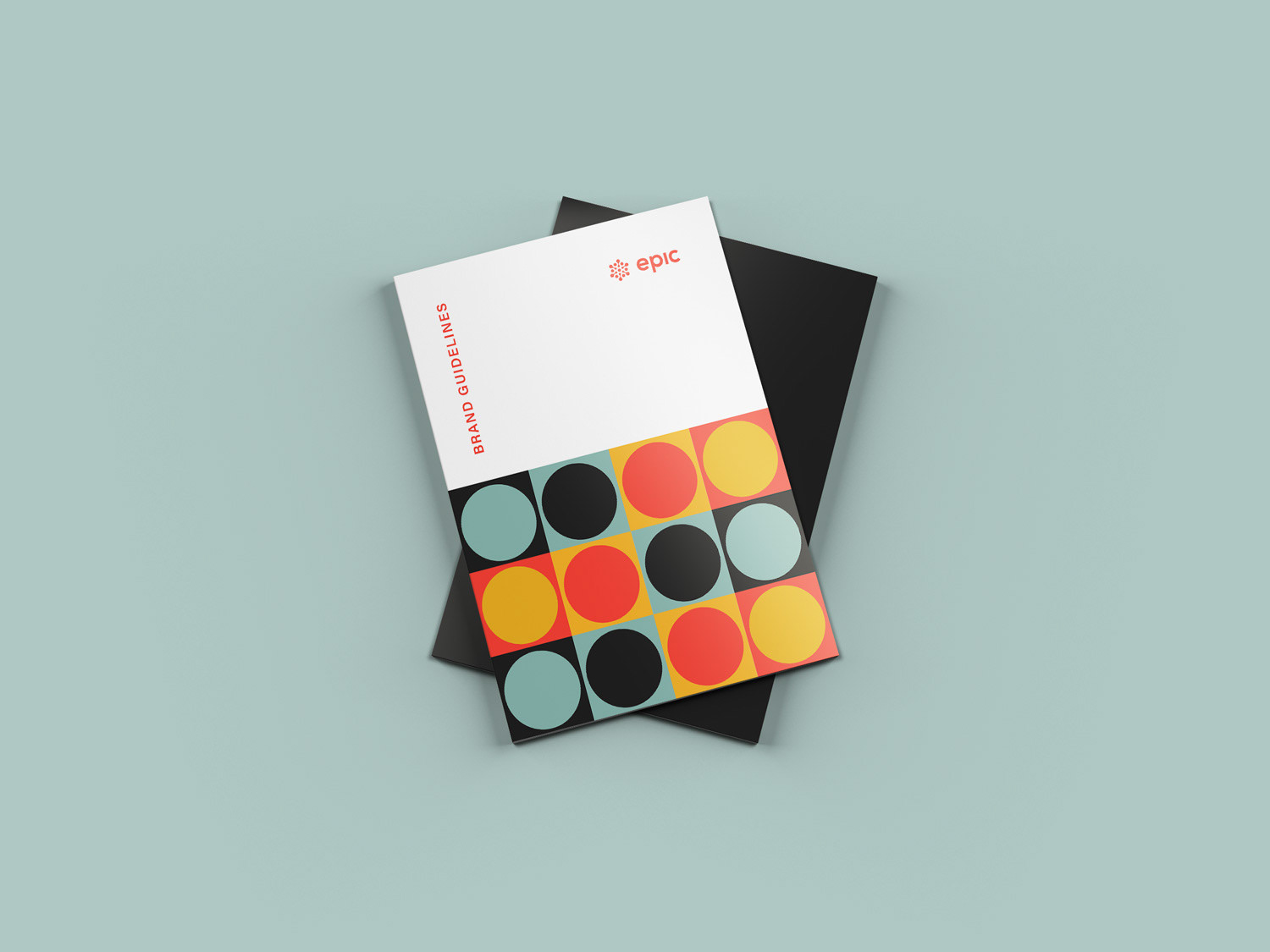
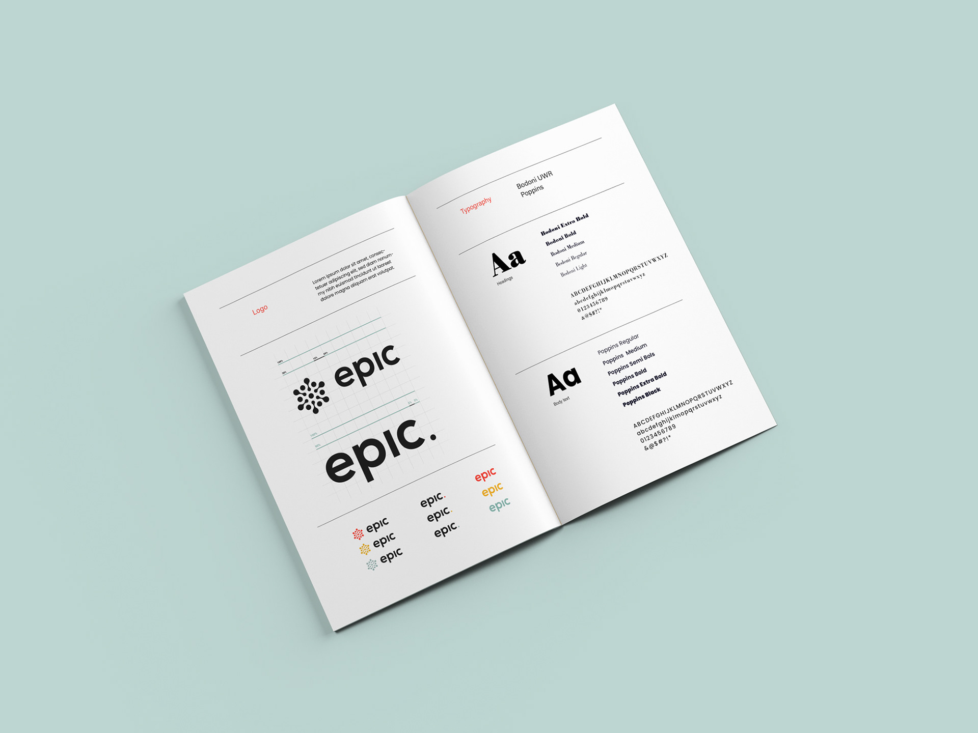
Brand Guidelines
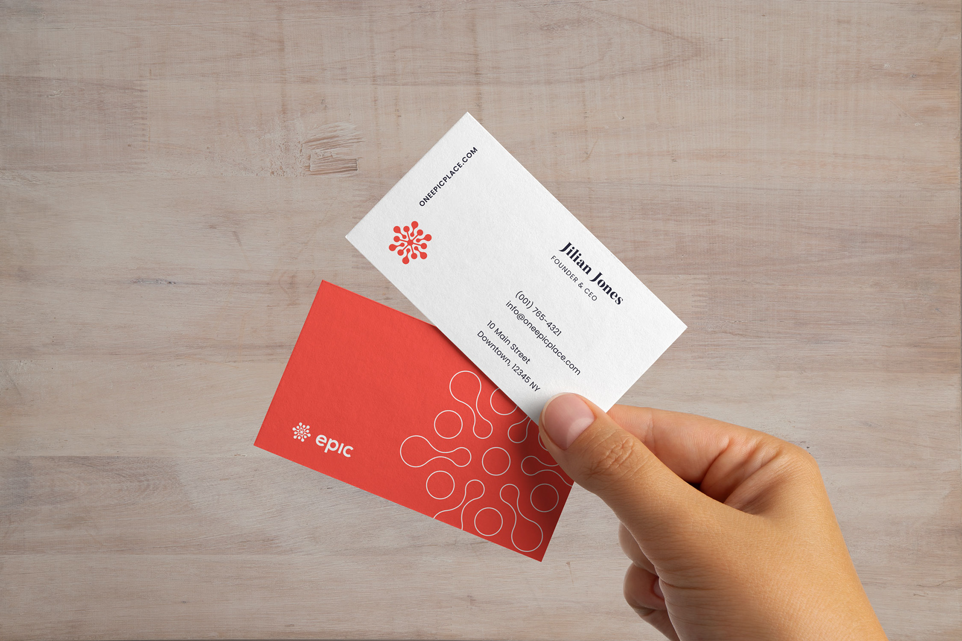
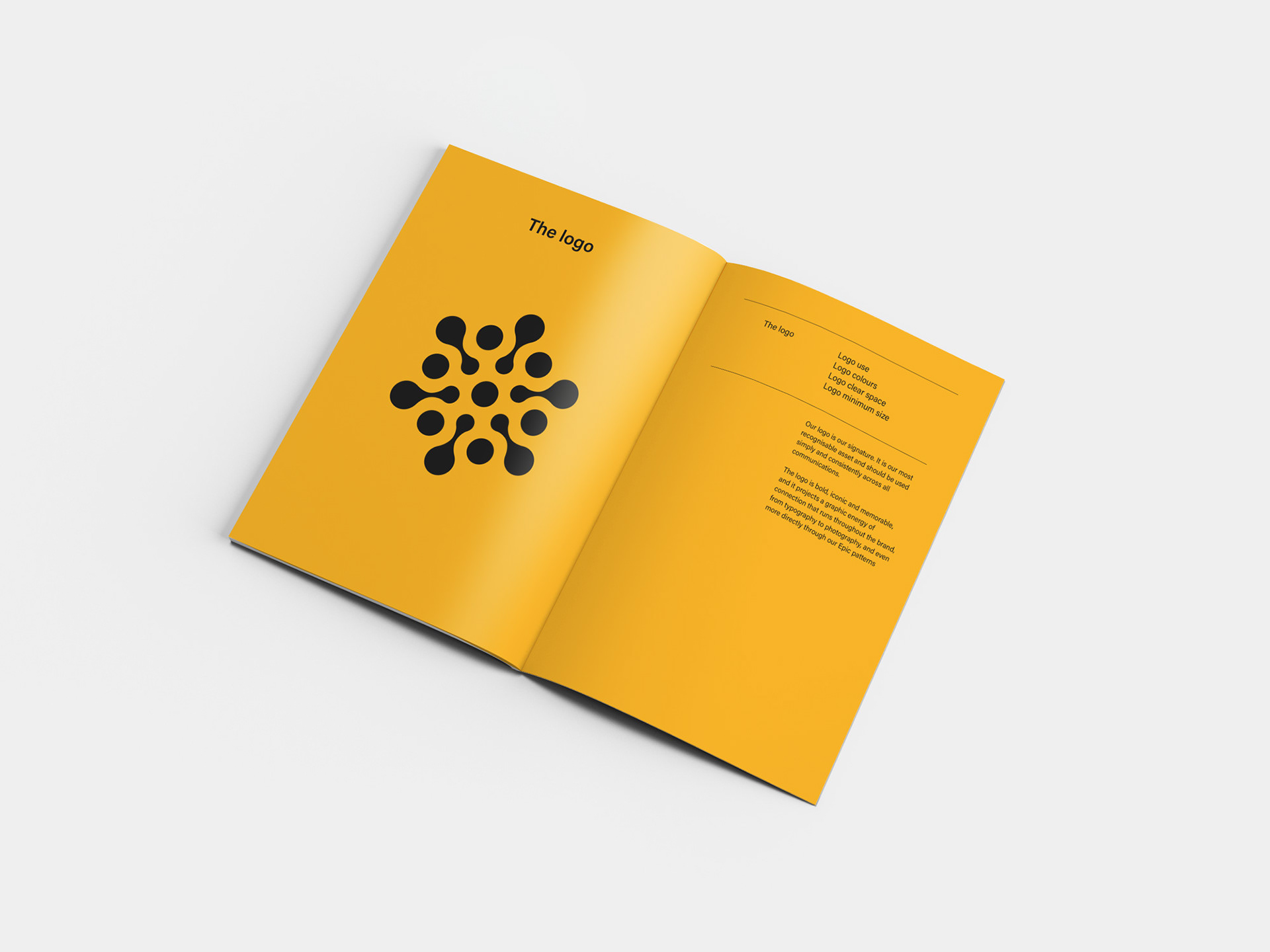
Starting from the visual identity we created new color palette guidelines, typography systems, photography guidelines, and graphic elements such as patterns, shapes, and their applications.
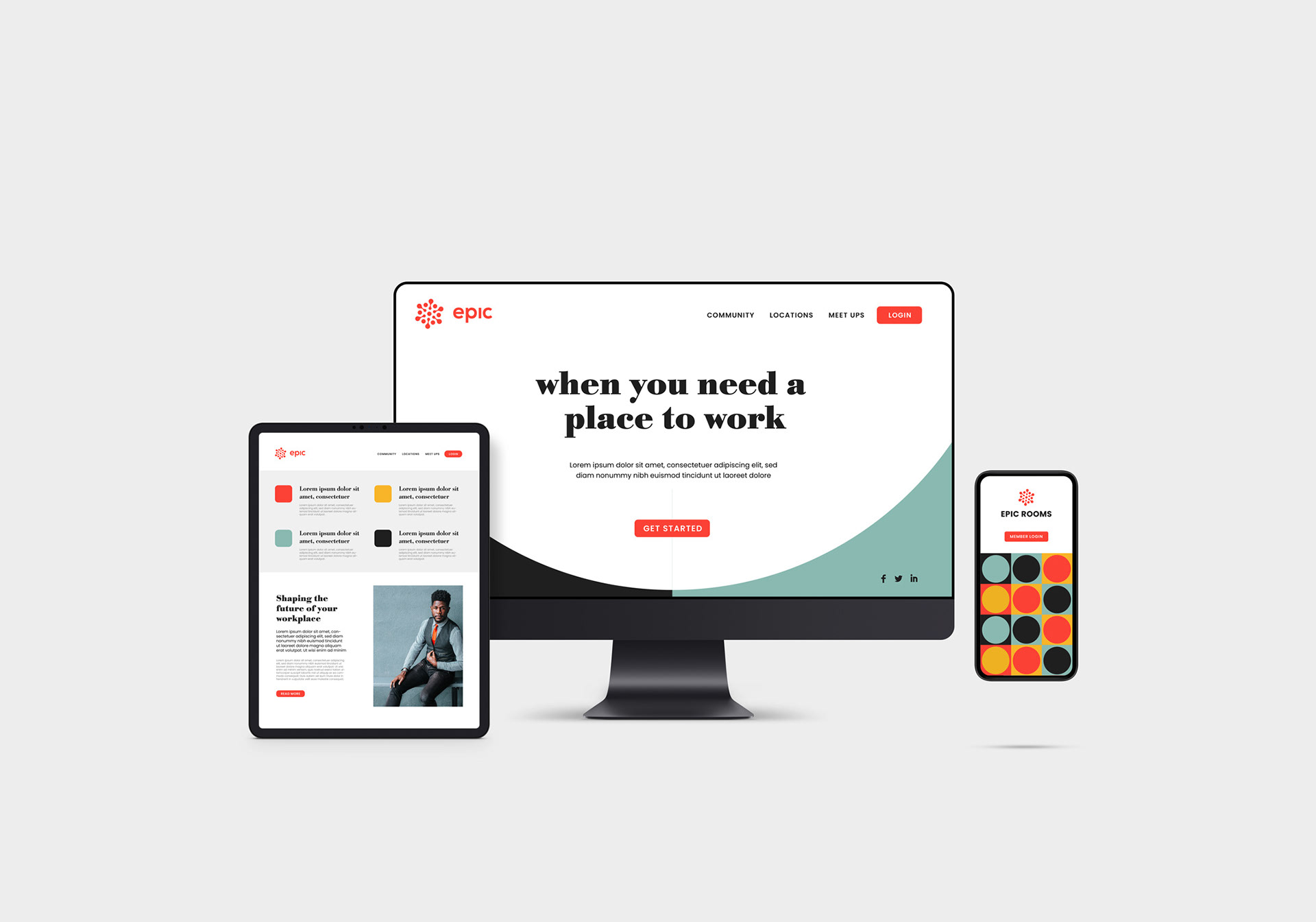
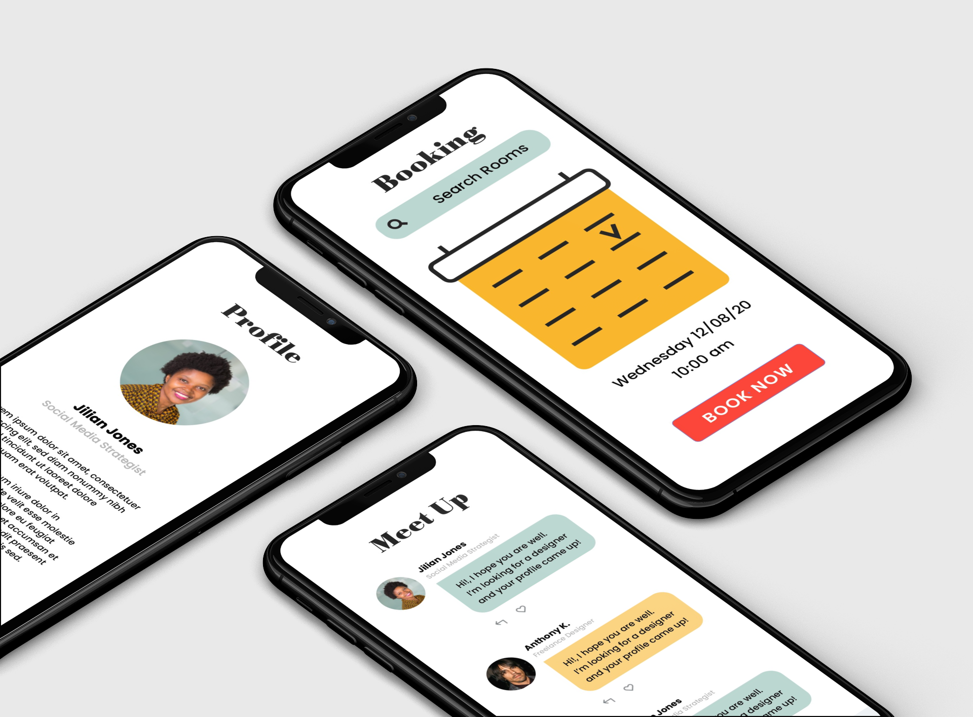
We managed to stylize and unify Epic’s identity into one cohesive brand, that will be used across multiple platforms, such as their website and web application. During the design process, we created components, guidelines, and general templates to easily scale as Epic’s user base grows with time.
We managed to stylize and unify Epic’s identity into one cohesive brand, that will be used across multiple platforms, such as their website and web application. During the design process, we created components, guidelines, and general templates to easily scale as Epic’s user base grows with time.
Epic Responsive Design
Writers submit stories to the quarterly topics. Curated stories are being published into books. We created a book template to keep a colorful and consistent look.
